%2012.30.03%E2%80%AFa.m..png)
There’s something majestic about seeing distributions layered with transparency — curves overlapping gently, each shape flowing into the next. It evokes the silhouette of a mountain range at sunrise. Specifically, it reminds me of the Andes — the longest continental mountain range on Earth, stretching across the spine of the Americas.

So, I propose a new name for what is often called an overlapped violin plot or a mirrored KDE plot:
The Andean Plot
A visual inspiration: multi-layered Andean peaks at dusk.
The Andes mountains, with their jagged yet fluid layering of ridges, valleys, and light, are the perfect natural metaphor for this kind of plot. When multiple distributions are mirrored across a horizontal axis — softly transparent and overlapping — they resemble the visual layering of distant peaks, each one slightly fainter, each one representing a different dimension of data.
It’s not just poetic — it’s useful.


Here’s why the Andean Plot stands out from traditional plot types:
Standard violin plots show distributions per category, usually side-by-side or split.
But when layered (as in the Andean plot), it allows direct comparison of shape and relative density in shared space, across multiple categories.
Box plots summarize five-number statistics but hide shape, modality, and skew.
The Andean plot makes distributional shape immediately visible, even between overlapping categories.
KDE lines can clutter when overlaid — overlapping densities become hard to interpret.
The Andean plot uses transparency and mirroring to preserve legibility and emphasize volume.
Comparing distributions of a continuous variable across categories.
Highlighting shape differences, not just center/spread.
When visual clarity and aesthetic impact matter — dashboards, presentations, data storytelling.
You can create an Andean Plot in Python with matplotlib, scipy, and seaborn, using fill_between() and KDE smoothing.
import seaborn as sns, pandas as pd, matplotlib.pyplot as plt, numpy as np
iris = sns.load_dataset("iris")
plt.figure(figsize=(10, 6))
species_list = iris['species'].unique()
palette = sns.color_palette("Set2", len(species_list))
x_vals = np.linspace(iris['sepal_length'].min(), iris['sepal_length'].max(), 500)
for i, species in enumerate(species_list):
subset = iris[iris['species'] == species]['sepal_length']
kde = gaussian_kde(subset)
y = kde(x_vals)
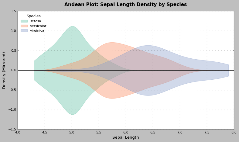
plt.fill_between(x_vals, y, -y, alpha=0.4, color=palette[i], label=species)
plt.title("Andean Plot: Sepal Length Density by Species", fontsize=14)
plt.xlabel("Sepal Length")
plt.ylabel("Density (Mirrored)")
plt.legend(title="Species")
plt.axhline(0, color='black', linewidth=1)
plt.tight_layout()
plt.show()I’m still early in my career as a data scientist, but that’s no reason to avoid naming something meaningful. “Andean Plot” isn’t about reinventing the wheel — it’s about naming the view when that wheel turns toward the mountains.
If it resonates with you — use it, share it, remix it.
Let’s make beautiful data.
%204.12.34%E2%80%AFp.m..png)
Built by Samuel.
All Rights Reserved.
© 2025 Signal Symphony.