%208.22.55%E2%80%AFp.m..png)
Flags are more than symbols — they’re brand identities for nations. Just like logos in corporate design, colors, shapes, and simplicity in flags can evoke trust, tradition, modernity, or, in our hypothesis… prosperity.
I set out to answer a simple but provocative question:
Are there visual patterns that distinguish the flags of wealthy countries from those of lower-income nations?
To explore this, I analyzed 213 national flags using a dataset that includes:
- Color palettes
- Symbols (stars, crosses, suns, moons, etc.)
- Layouts (stripes, crosses, emblems, etc.)
- GDP per capita (PPP) from IMF data
You can view a cleaned version of the dataset here.
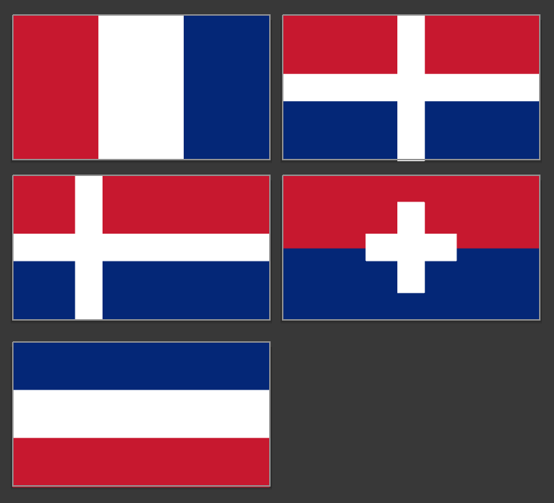
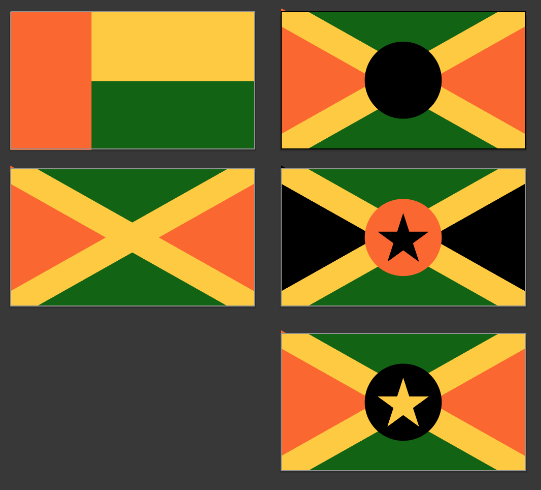
I created two fictional countries to visualize design principles at opposite ends of the wealth spectrum:
Simple and clean designs
Limited palette: Red, White, Blue
Geometric shapes: Crosses and plus signs
Minimal to no emblem detail
Bright, complex color combinations: Green, Yellow, Orange, Black
Symbol-heavy: Stars, circles, crosses
Higher visual density
See the resulting fictional flags below:
Red, White, and Blue dominate high-GDP flags (avg. $26–29K)
Green and Yellow dominate lower-GDP flags (avg. $15–19K)
Fewer colors = higher income: flags with only 2–3 core colors tend to belong to richer nations.
Flags featuring crosses, pluses, or clean stripes tend to correlate with higher GDP.
Stars, moons, and circles are more prevalent in lower-GDP flags.
%205.15.57%E2%80%AFp.m..png)
Why might this be the case?
Weather: Blue and white evoke trust, calm, and order — traits often associated with stability, formality, and colder, high-latitude nations. In contrast, equatorial and tropical regions tend to favor vibrant hues like green, orange, and yellow, which convey energy, fertility, and cultural dynamism, but can also be interpreted by outsiders as more informal or volatile.
Crosses vs. Stars: Crosses may suggest historical continuity, religious legacy, or European lineage — often tied to long-standing institutions and developed nations. Stars and circles, more frequent in post-colonial or revolutionary contexts, tend to represent aspirations for unity, struggle, or collective identity.
Flag design reflects and reinforces national identity — including perceived prosperity.
Designers, marketers, and policy-makers might consider these insights when crafting symbols that aim to communicate trust, stability, or ambition.
Wealth doesn’t require a clean design… but it often chooses one.
1. Apply image classification to flags and train a model to predict GDP tier from design alone.
2. Build an interactive visualization tool to explore flags by income, color, and pattern.
%204.12.34%E2%80%AFp.m..png)
Built by Samuel.
All Rights Reserved.
© 2025 Signal Symphony.